Symptoms Tracker

My Role

Brand Designer

Tools

Figma

Overseen by

Creative Director

My role

Brand Designer

Deliverables

Hero images, templates

Tools

Figma

Overseen by

Creative Director

Context

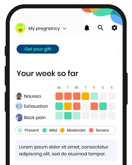
The design challenge was centered on how to visually represent the "present" state in the symptom chart. "present" indicated that a user logged a symptom without specifying its severity.

My role was to determine how to color-code this state so it was clearly distinguishable from the severity levels, while still communicating that the symptom had been tracked. The goal was to make the chart intuitive and prevent users from mistaking "present" as another severity level.

The problem

The original color used for "present" was light green, which could be easily confused as the least severe symptom rather than indicating that the symptom was simply logged without a severity.

The final solution

The final solution uses a green outline to indicate that the symptom had been logged, but its severity had not been specified yet.

Using color to
differentiate "present"

Using a different color could help users understand that "present" meant something different from the severity levels. However, "present" still represents a symptom, it just means the severity hasn't been specified yet. While this solution worked, the final design communicated that relationship more clearly.

The first option

Using red initially seemed like a strong solution because it naturally conveys higher severity. However, it also signals warning and urgency. Since the goal of the feature was to help users track symptoms without increasing anxiety, red ultimately wasn't the right choice.

The problem

The original color used for "present" was light green, which could be easily confused as the least severe symptom rather than indicating that the symptom was simply logged without a severity.

The first option

Using red initially seemed like a strong solution because it naturally conveys higher severity. However, it also signals warning and urgency. Since the goal of the feature was to help users track symptoms without increasing anxiety, red ultimately wasn't the right choice.

Using color to differentiate "present"

Using a different color could help users understand that "present" meant something different from the severity levels. However, "present" still represents a symptom, it just means the severity hasn't been specified yet. While this solution worked, the final design communicated that relationship more clearly.

The final solution

The final solution uses a green outline to indicate that the symptom had been logged, but its severity had not been specified yet.

Say hello

brittanyj.fung@gmail.com

© 2026 Brittany Fung. Made with lots of love

Say hello

brittanyj.fung@gmail.com

© 2026 Brittany Fung. Made with lots of love

Say hello

brittanyj.fung@gmail.com

© 2026 Brittany Fung. Made with lots of love

Say hello

brittanyj.fung@gmail.com

© 2026 Brittany Fung. Made with lots of love